
Posted by Graeme Short
Categories
SIMULATIONTable of contents
Introduction
Amplitude curves, to define the temporal variations of lots of ‘quantities’ in Abaqus, are a very useful bit of functionality to augment the default ‘STEP’ or ‘RAMP’ variation of inputs through a step.
Indeed, as well as being able to define very complex time or frequency variations in a piece-wise fashion, using the general tabular input method, there are a number of inbuilt amplitude types that do the mathematical heavy lifting for the user if they provide only the necessary constants to define the mathematic function. That’s fine, but how do you visualise the resulting amplitude curve when the combination of function and constants is resolved for use in the model, to make sure it’s doing what you intended?
You could resort to testing the definition in Excel, but handily there is a native tool in Abaqus/CAE that will do this for you. However, the ‘Amplitude Plotter’ tool is independent of the workflow to define the amplitude itself and so its existence is not obvious unless you know where to look!
Example:
Let’s consider an example where we want to create and visualise a relatively complex periodic function with the following characteristics:
- An amplitude of 1 unit
- A frequency of 10 Hz
- An initial amplitude of 1 unit
- A staring time for the sinusoidal curve after 0.5 seconds.
First, we go to the Model Tree and double click on the ‘Amplitudes’ function, choose the ‘Periodic’ option for the inbuilt amplitude types and enter the relevant parameters as described above, as shown in Figure 1.

Figure 1 – Process to define a periodic amplitude curve in Abaqus/CAE
Now having defined this amplitude, we can go to the ‘Load’ module and navigate through Tools > Plug-ins > Amplitude Plotter to access the native tool which will evaluate the amplitude definition and visualise the plot to confirm it is correct.
The tool is self-explanatory, with the workflow for this example shown in Figure 2. If the response is incorrect, simply edit the Amplitude definition and replot the curve until correct behaviour is confirmed.
A neat feature of the Amplitude Plotter is that the X-Y data of the displayed amplitude can be saved as session data to overlay with other X-Y data you might extract and plot, perhaps from the results of the model using the amplitude.
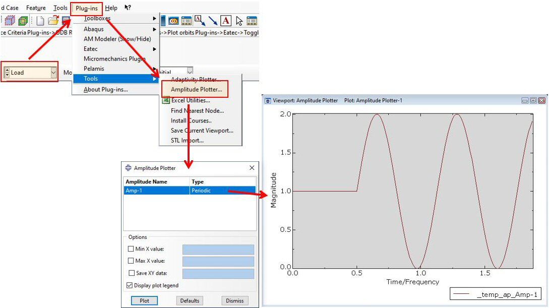
Figure 2 – Workflow to access the Amplitude Plotter tool and visualise and Amplitude Curve
Summary
The Amplitude Plotter is another useful tool that is ‘hidden in plain sight’ within Abaqus/CAE. The workflow is really simple and intuitive, and can side-step a lot of uncertainty when defining inputs for an Abaqus model. The traditional alternative would be to wait for the results of the simulation to become available, review what response the definition for a particular Amplitude type produced, and then unpick whether that was correct or not.


TECHNIA Simulation provides top tier FEA, Non-linear, and Advanced Simulation Software, Training, and Consultancy. Our dedicated team of more than 65 Simulation experts across 16 countries advise and support your innovation with a wealth of specialist knowledge and experience.
About TECHNIA- Related news and articles straight to your inbox
- Hints, tips & how-tos
- Thought leadership articles

Helping you find the information you’re looking for. Discover webinars, events, FAQ's, case studies and tutorials.
VIEW HUB